Introduction
The world has recently been affected by the pandemic, Covid-19 that has currently grown to more than 3 million cases in the world. The growth rate has been exponential. Different countries have handled the outbreak in different ways, with varying degrees of success.
A recent on-going Kaggle competition provides the data and the incentive to competitors around the world to predict the pattern of the disease and the course taken by different countries. The aim is to answer certain key questions regarding the disease and identifying underlying trends.
The time-series data was used in this project to model and forecast the total # of cases into the future. The main aim was to design a model for the time-series data and forecast the number for the future. Data was chosen was a single country, India, for this purpose. A R-Shiny dashboard was designed and built to scale the models to all the countries. This provides the flexibility to the user to select a country and create a model of their choice to achieve a forecast.
The RShiny dashboard that was built could be found here. Below is a small snapshot of the same.
Data
While the data was provided as part of the Kaggle competition, the original data source is from the John Hopkins database. The key columns in the dataset include the following information.
-
Province and Country – To identify the country, and in a few cases the province
-
Date – Daily date for when the observation was recorded
-
Confirmed Cases and Fatalities – Total confirmed cases and fatalities on that date
Approach
Data was taken for India, and the preliminary plots were visualized. Data was from 30^th^ January to 17^th^ April and contains about 79 data points. This was converted into a time-series data object. It is not surprising to see that there is an increasing trend in the data. Post the initial few days, the number of cases has risen exponentially (which already suggests non-stationarity). The augmented Dickey Fuller test results in a p-value of 0.99, and this implies non-stationarity (failed to reject H0).
By intuition, there cannot be a seasonal component as now (and hopefully will not be in the future!). The ACF suggests slow decay, giving way to a necessity of an ARIMA component, including perhaps a difference operator.
A differencing of the first order suggests that the mean looks relatively stable. There might be non-constant variance but the ADF test results in a p-value of 0.01, which is satisfactory. We could conclude that the data is relatively stationary. This makes the order d = 2.
The new dataset was created with the difference, and once again plotted to visualize the ACF and PACF plots. These provide certain guidelines on the order of p and q, based on which a model could be fit on the dataset.
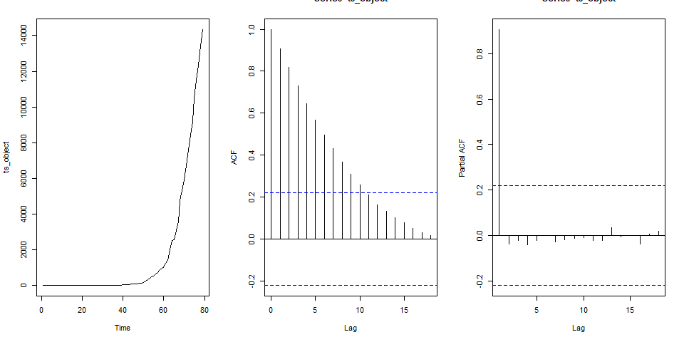
Figure 1 - Plot for original time-series
To build the model, the auto.arima() function suggests an ARIMA(0,0,4) with a non-zero mean on the differenced dataset. The same function returns an ARIMA(1,2,2) on the original time series. Below is the plot, acf and pacf of the time series with diff 2.
The ACF suggests that there is a moving average component of at least till q = 1. The PACF plot suggests that there is an AR component till perhaps p = 3. The auto.arima results support this, suggesting that a ARIMA(1,2,2) model might be appropriate.
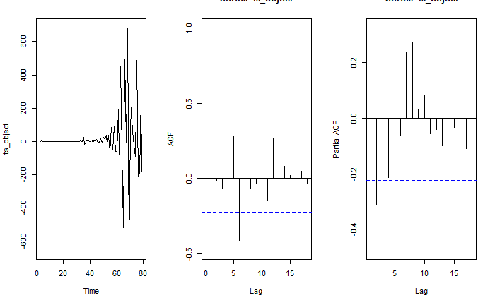
Figure 2- Plot for time-series with diff(2)
Based on these intuitions and preliminary data results, the modeling process is conducted.
Model Building and Comparison
Based on the results of the ACF and PACF plots, multiple iterations of the ARIMA model were run. The main criteria for comparison were the AIC values (lower value is better), Box-Ljung test (with lag = 10) for residual analysis and the forecast value itself to get a check how different the values are. Below is a simple comparison of the same.
| Model | AIC | df | p-value | Result |
|---|---|---|---|---|
| ARIMA(1,2,2) | 969.4 | 7 | 0.052 | No lack of fit |
| ARIMA(2,2,2) | 966.7 | 6 | 0.015 | Lack of fit |
| ARIMA(0,2,4) | 965.6 | 6 | 0.013 | Lack of fit |
| ARIMA(1,2,0) | 993.2 | 9 | <0.01 | Lack of fit |
| ARIMA(2,2,4) | 954.3 | 4 | 0.06 | No lack of fit |
| ARIMA(4,2,4) | 961.5 | 2 | 0.004 | Lack of fit |
Table 1 - Model diagnostics comparison
The model diagnostics involved checking the residual plots for normality, the ACF of the residuals and the histogram of the residuals (to check for normality).
To recap, the Box-Ljung test was used to calculate if the model presents with a lack of fit.
-
H0 – The model does not exhibit a lack of fit
-
H1 – The model exhibits a lack of fit
It is noticed that the ARIMA(2,2,4) presents with the best AIC value, while only ARIMA(1,2,2) and ARIMA(2,2,4) has a high p-value for a Box-Ljung test with lag = 10. These two models will be examined a little more closely to see which presents with the better fit.
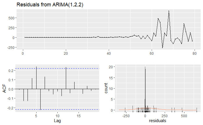
Figure 3 - Residuals from ARIMA(1,2,2)
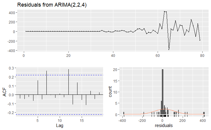
Figure 4 - Residuals from ARIMA(2,2,4)
The time plot shows some variation in the data. The histogram for the residuals suggest normality in both the cases (better for ARIMA(2,2,4) model). The auto-correlation plots show a couple of significant spikes at certain lags for both the models. The auto-correlation is not large and the residuals provides a favorable Box-Ljung test result. The residuals appear to be random. In fact, only the only model with ACF(residuals) within limit was the ARIMA(4,2,4), but the Box-Ljung test suggested a lack of fit.
The fitted values show approximately similar results for both the models. The ARIMA(2,2,4) model seems to fit the time series better around the 65-70 data index range. A t-test was used to test the significance of the coefficients for both the models using the coefficient and the standard error of the coefficient. Both the models have coefficient p-values that are < 0.05, suggesting significance.
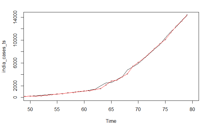
Figure 5 - Forecast from ARIMA(1,2,2)

Figure 6 - Forecast from ARIMA(2,2,4)
Forecast and comparison
The forecasts look to follow the same trend, with pretty similar results for the next 10 days as is shown in the plot below. This was calculated for immediate next 10 days.
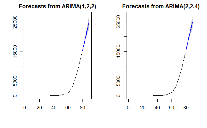
Figure 7 - Forecasts from both models for 10 days
The recent data for the past 10 days (sourced directly from Google tracker) were selected for a general comparison of how the model performs. While the first few forecast values fall close to the actual Total Number of Cases, as the days progress, the forecast starts deviating, up to 15% deviation after 10 days. It also looks the like the actual number of cases have double in 10 days, while the model forecasts are lower. This suggests that the growth rate of the disease is increasing.
| Date | ARIMA(1,2,2) | ARIMA(2,2,4) | Actual | Diff ARIMA(1,2,2) | Diff ARIMA(2,2,4) |
|---|---|---|---|---|---|
| 4/18/2020 | 15398 | 15621 | 15712 | 2% | 1% |
| 4/19/2020 | 16452 | 16568 | 17265 | 5% | 4% |
| 4/20/2020 | 17512 | 17686 | 18600 | 6% | 5% |
| 4/21/2020 | 18577 | 18758 | 19984 | 7% | 6% |
| 4/22/2020 | 19645 | 19751 | 21393 | 8% | 8% |
| 4/23/2020 | 20715 | 20778 | 23077 | 10% | 10% |
| 4/24/2020 | 21787 | 21841 | 24506 | 11% | 11% |
| 4/25/2020 | 22859 | 22881 | 26496 | 14% | 14% |
| 4/26/2020 | 23933 | 23906 | 27892 | 14% | 14% |
| 4/27/2020 | 25008 | 24945 | 29435 | 15% | 15% |
Table 2 - Comparison of model forecast vs actual data
R Shiny Application
To perform a similar analysis as of that taken for one country, India, the team built an interactive R-Shiny dashboard that provides insight into the time-series and modelling flexibility. The functionality of the app is as explained below -
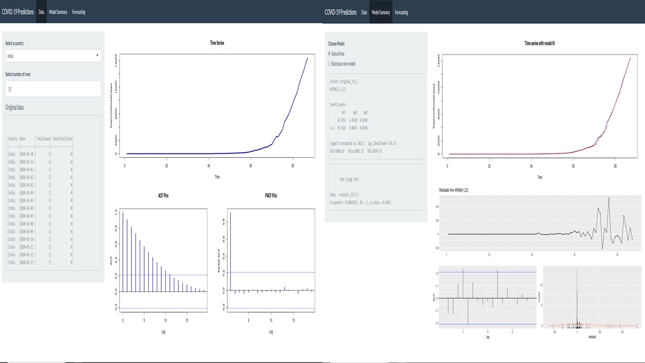
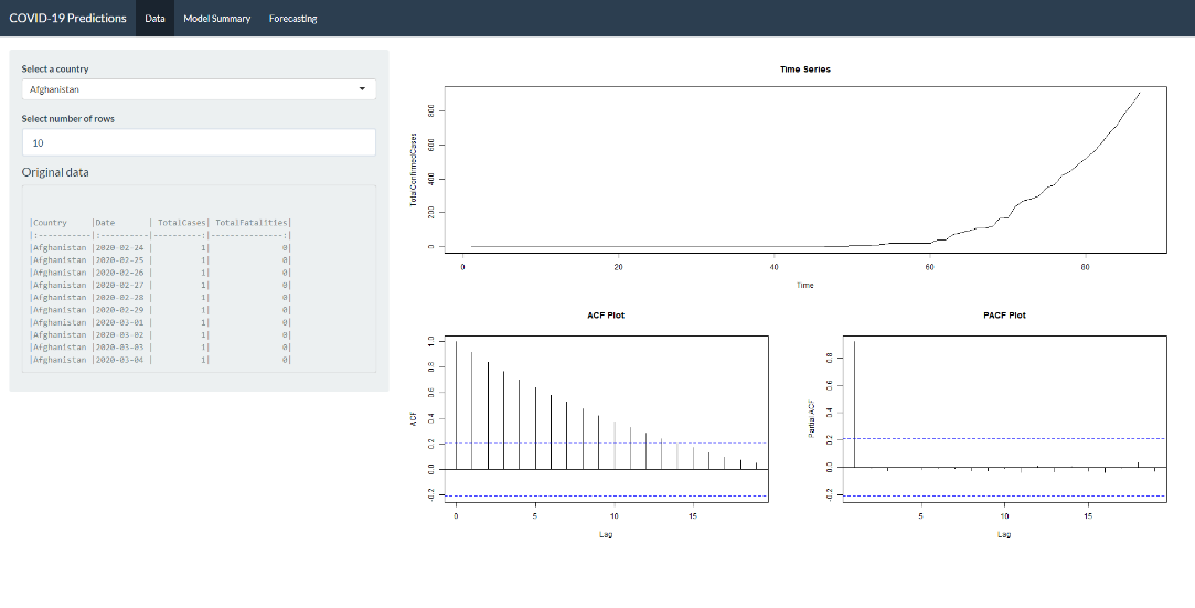
Data Tab
This tab helps us understand the original data in detail. There are 2 filters in this tab:
-
‘Select a country’ – To choose the country for the COVID 19 forecasts (Default: Afghanistan)
-
‘Select number of rows’ – To choose the number of rows of raw data to be displayed. This will help in viewing cases and fatalities for a country at a date level. (Default: 10)
There are 3 plots in addition to the display of raw data in this tab. The first plot shows the data as a time series object for us to understand the pattern in data. The ACF and the PACF plots are displayed below to understand the lag auto-correlations. These plots also help in building our own model in the next tab where we have an option to build our own model.
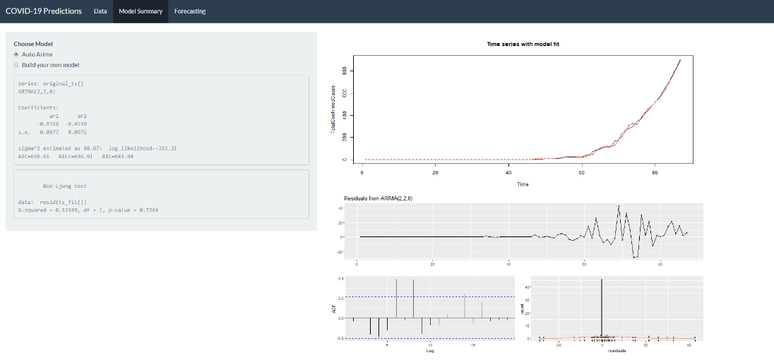
Model Summary Tab
This tab has an option to either go with the model from the auto.arima function or to build a model by specifying the values of p, d, and q. Auto.arima is chosen to be the default option as this will give a starting reference for further adjustments. The default value for building the model is (0,0,0) and the model will not accept any negative values as input for the values of p, d, and q. Once we make the required choices, the model summary and the results of the Box-Ljung test are displayed in the side panel. The former will provide the coefficients of the AR and MA parts of the model and the latter will check for autocorrelation in the time series residuals.
In addition to this, the residual plots are displayed for diagnostics to check if residuals are uncorrelated, is stationary and are normally distributed. The model fit values are plotted with the data for a comparison of how well the model performs.
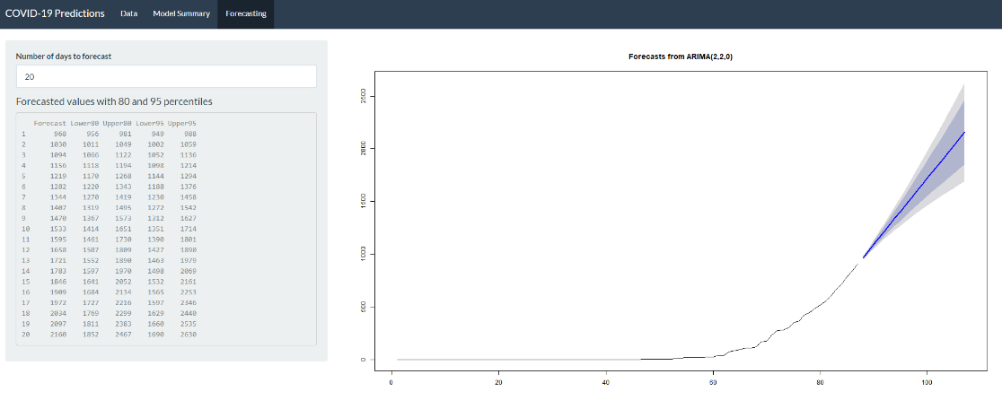
Forecast Tab
This tab focusses on generating forecasts from the model built. There is an input field to enter the number of days into future that we want to forecast and based on this, the forecast is generated along with the 80% and 95% confidence bands. One can notice how the width of the band increases when the days of forecast to be included increases.
In addition to this plot, we also have a table in the side panel which shows the values of the forecasts along with the values for upper and lower bands for 80% and 95% confidence. The minimum number of days to look at the forecast is set to 0 and the maximum number is set to 30.
Conclusion
The results of the exercise conclude that an ARIMA(2,2,4) model fits well with the data of total number of cases for India. The model predicts the increase in the total number of cases over days. This increasing trend suggests the path of the disease if no remedial measures are undertaken, suggesting the consequences of the inaction. As more and more data are added, one could compare how the model performs and how the growth rate varies.
The scalable R-Shiny application serves as a good reference and starting point to building comprehensive models for other countries. While better models might be fit and better diagnostics may be performed, the dashboard allows for a quick starting point and if not, a simple model that serves the purpose.
One could improve the models and the forecasts by choosing other measures of making a model stationarity (like log transform, moving average) and with advanced modelling approaches (ARIMA with other predictors).
Appendix – R-Shiny Application Screenshots
Data Tab
Model Summary Tab
Forecast Tab